
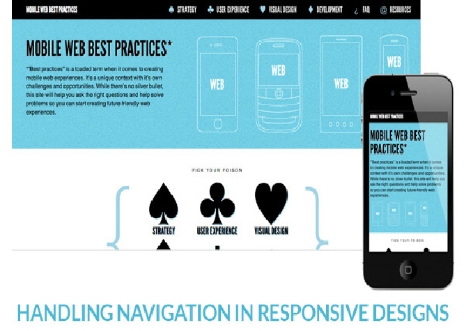
First of all, what is responsive design?
You may be viewing this article from your tablet or smartphone?
You do not need to reduce the size of the text with your little fingers so that it is fully visible on your screen. Or you do not need to zoom in on the text and scroller from right to left and left to right as when your eyes follow the course of a ball on a tennis court?
Not very comfortable, you will agree.
Well that’s the responsive design. A page that adapts to the size of your screen, whatever it is: smartphone, tablet, PC … no need to perform all these manipulations to read a text comfortably.
Of course it requires to adapt its design to all screen sizes, text, images, the layout of the elements of a page … But when we know that the internet traffic of smartphones has doubled in one year, that the smartphone market share will exceed 20% this year and the consultation on mobile screens is about to exceed those on PC, there is a real issue to consider.
So the future?
We will have screens bigger and bigger, PC monitors and TV screens; smartphones almost as wide as mini tablets and tiny screens like smart watches.
In short there will be screens everywhere and all the time and the challenge will be to adapt to all types of support.
So for your next website or for your current site, think about responsive design!